ING
Case study
ING had the challenge of update its public website, making it accessible and improving the conversion with a new design aligned with the brand guidelines and trying to keep a low development effort.
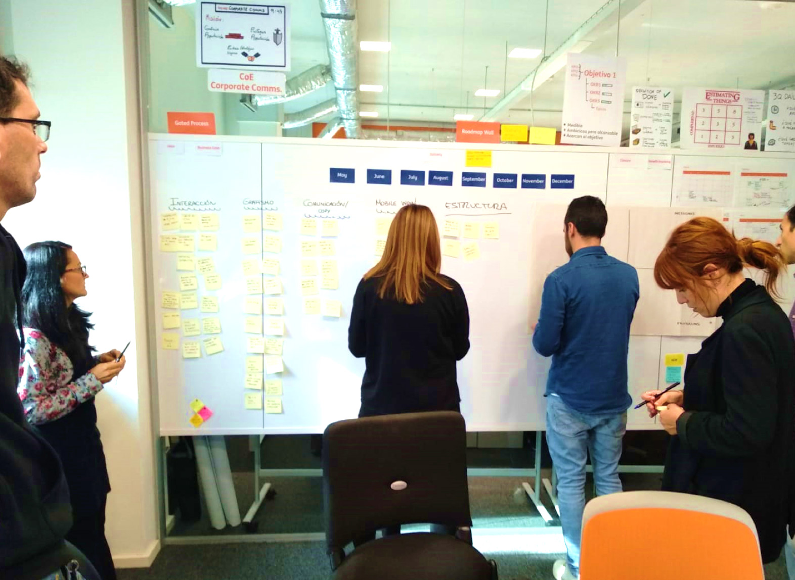
The UI team worked side by side with marketing department in the analysis and the approach for the redesign in several sessions
01
Analysis
Brand requirements
Design point of view
02
Workshop
Benchmark
Moodboard
Product attributes
DAFO analysis
03
Design
Proposals
Final design

Analysis
We defined a series of requirements following some main guidelines
Brand requirements
- Relevant + Inspire
- Memorable and daring
- Speak my language
Design requirements
- Compliance with brand guidelines
- Usability + simplicity
- Irresistibility
Workshop
Worked in a benchmark and mood boards. Based on this attributes were added on the following axes:
- Interaction
- Graphics
- Communication
- Mobile
- Structure
Once all the attributes were included, the attributes were scored and a DAFO analysis were made.
Design
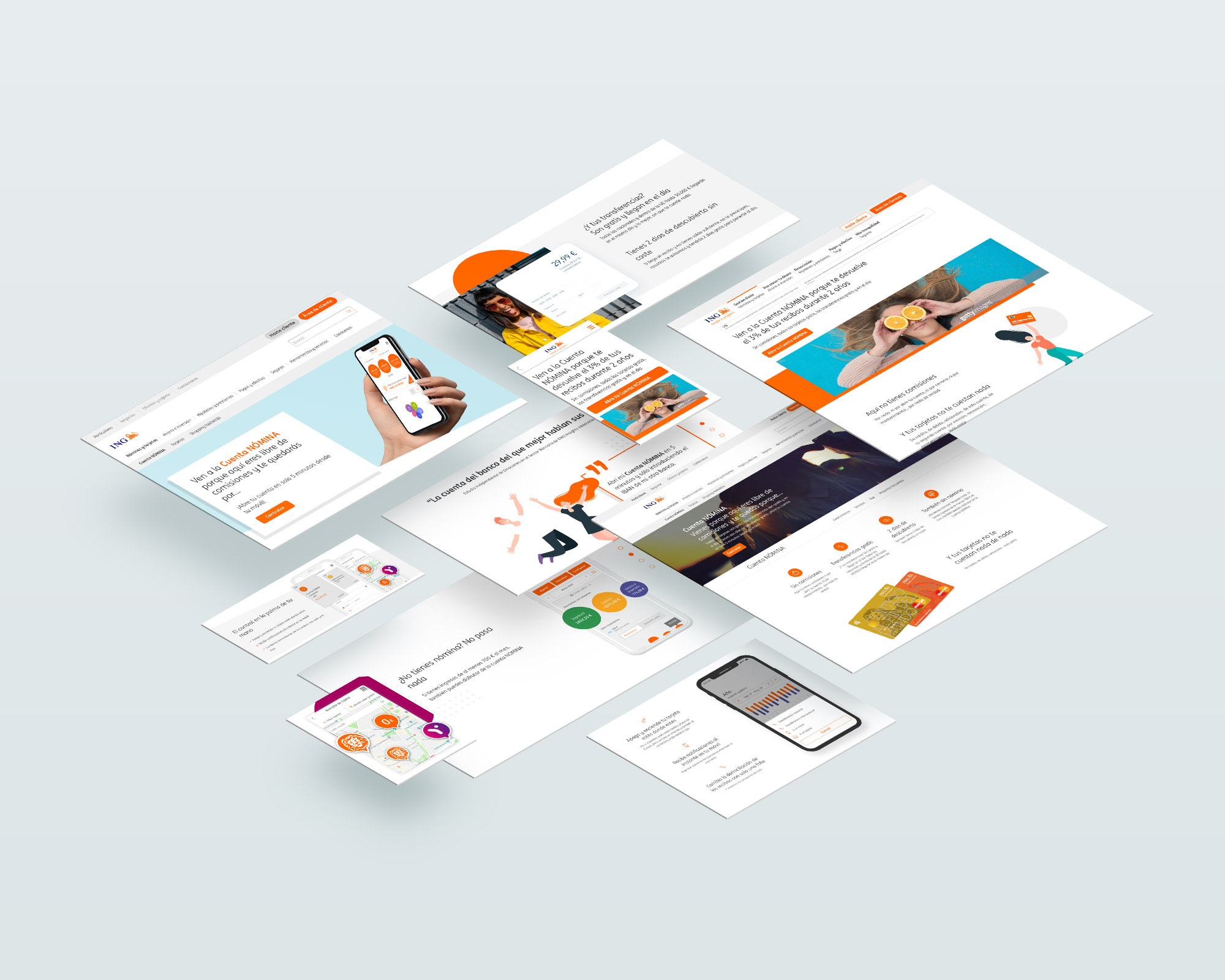
Based on the learnings extracted from the workshop three proposals were defined with differentiated lines.
- A proposal giving greater importance to graphics and the use of geometric shapes. Exploration of the use of color.
- More aligned to the visual identity and the new design system. Inspired by the style of other ING pages in different countries.
- Based on the use of interactive elements using the scroll and with a minimalist graphic line.
The idea behind these quick proposals was to iterate the elements and concepts that worked after a few tests and meetings, work hand in hand with the front-end team, and create a new design and several components that should fit and function properly within of the existing CMS structure.
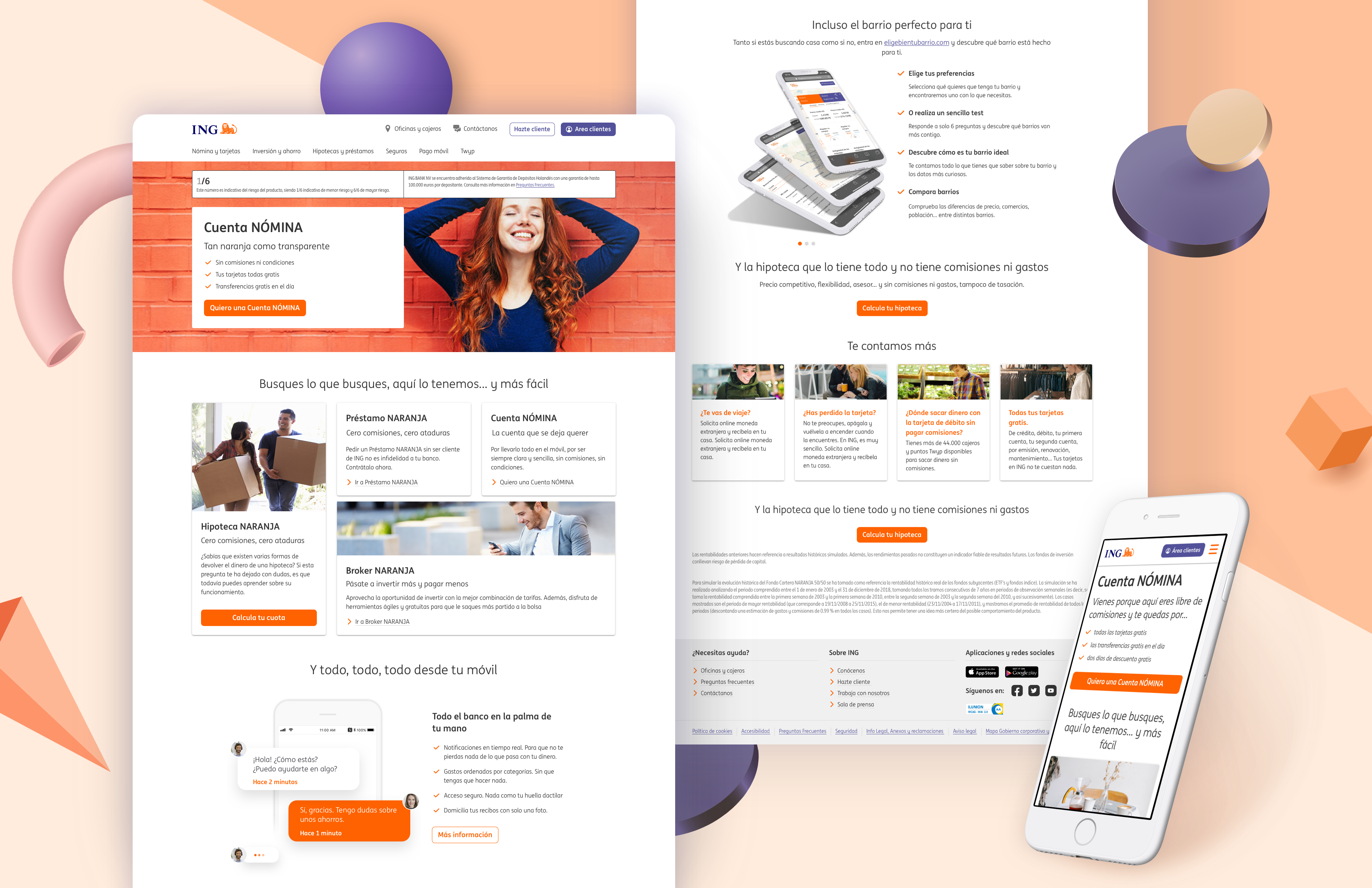
Final design